FRANKENTHALER TRANSPARENCY
Helen Frankenthaler painted transparently. She diluted oil paint with turpentine. This resulted in the paint acting more like a stain on the canvas, as it soaked in. The result was her breakthru into a new style of painting, referred to as “color-field painting.” It was also derided as being pretty, or something to simply delight the eye. Her sin was that the layers were more like a watercolor, rather than hard and opaque layers on top of the canvas.
“Pouring liquid pigment onto bare canvas spread out on the floor, Frankenthaler created breathing landscapes of shifting, almost transparent, color zones. These atmospheric color washes, actually embedded in the cotton fibers, achieve an optical sense of depth while avoiding perspectival illusionism and maintaining the flatness of the canvas.” 1

Gopnick, writing recently in The New Yorker, brings out the masculine and the feminine overtones in all of this. It seems that it is masculine to arrange on the canvas solid, opaque blobs of paint, and it is feminine to arrange blobs / tones that become part of the canvas. Somehow, transparent tones merely delight the eye, as a decoration, whereas thick opaque tones speak to the unspoken, solid, fundamental, unquestionable, and mechanical workings of the world. Bottom line, it must be serious when it is opaque, and decoration when it is not.
“Social radicals still sometimes think that only ‘subversive’ art – tense and tedious, can be serious, while things that look like big watercolors cannot be. This dismissal leaps past gender to the heart of the modernist enterprise, where Monet’s dealing in painting for the eye is still suspect, and Matisse’s calm insistence that he saw his art as akin to a comfortable armchair for an exhausted businessman is still the most taboo of all artist manifestos.” 2
I had not thought about the binary of opaque = masculine and transparent = feminine. Shapes in Representational Spacetime makes it masculine (…it’s men who made this world, Alice), yet the transparency which is required to actually know the object as a form makes it feminine (…well, I’m finally glad to hear one of you admit it)? It turns out that transparency is at the heart of the modernist enterprise. All of this, of course, only hints at the gender and race skew of all of Western art. This binary link will be added to the list that we are tracking, which can be found on page 30 of Transparent Drawing.
Still, are you feeling a tug at your consciousness? Do you feel a movement away from opaque blobs of paint? The flushing sound you hear is our riddance of all of these artificial binary cultural constructs. There, doesn’t that make you feel a lot better?
Frankenthaler’s most revered work is Mountains and Sea. Yet why, WHY, at the threshold of transparency, were the tones essentially arranged next to each other, as if they are opaque? As the Guggenheim tells us above, she created color zones on the canvas. Color zones? Are you serious? A zone is exclusionary. What do zones of color have to do with anything?
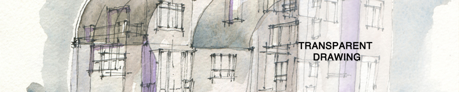
Come on, Helen! Come on everybody! The drawing above is my modest attempt to use her basic geometry as a springboard towards form. Then, with Drawing from Drawing, I was able to move closer to holistic form, drawing below. The form generation process you just witnessed provides an Authenticity Quotient of 100.
- https://www.guggenheim-bilbao.eus/en/exhibitions/after-mountains-and-sea-frankenthaler-1956-1959
- Gopnick, Adam. “Fluid Dynamics, What Helen Frankenthaler brought to the canvas”. The New Yorker. April 12, 2021. Print. P 61.

Recent Comments