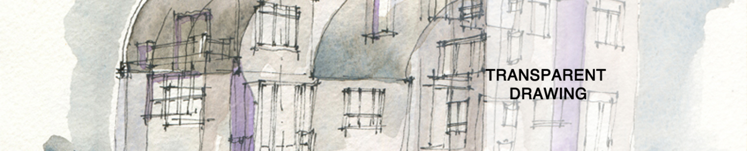
OPACITY
The drawing above violates two key Transparent Drawing precepts. It tries for opacity. And it was knowledged from a single photograph. The horror!
The tones were done with acrylic ink. I tried to make the grey (mixed with black and white) and the brown (mixed with brown and white) to be as pasty as possible, just to see what would happen. The tones are undiluted, straight out of the bottle. Based on the drawing, the grey tone was nearly 100% opaque, as it is difficult to read the tones under the grey panels. The brown maintained a relatively low transparent percentage. Opacity flattens out the form. Opacity decreases knowledge, just as we knew it would.

Single Image
What I find compelling when I look at the drawing is how comfortable the grey tones feel. And by comfortable, I mean representational. I get that knee jerk attraction to the cultural weight of opaque tones applied next to each other. It’s like eating Doritos: I’ve evolved past that, but damn they are good.
When I go into a museum now, I can’t shake my conviction that it is all nothing but arranged opaque shapes, trying for God knows what: emotion? The world is a mess, and all anyone can think to do is arrange opaque shapes on a flat piece of paper? And for what? To express an inner feeling? We’ve got problems to solve, people. And one window into that higher cognizant realm is form! Resolve form. Imagine form. Analyze form. Knowledge form. Get out of your culturally induced rut. Forget opacity. Forget Representational Spacetime.

Hi, I wanted to simply point out that the grey colour is the outcome of all primary tones together at balance. So it makes it a connection means between each colour put on any painting. It may come for help in your thinking.