PROUT LITHOGRAPHS

When the thought crossed my mind: use two Prout Lithographs as Source Images, I was all in.
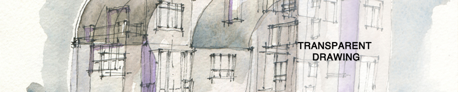
By now it should be clear what is going on with the drawing:
–Form Combine / Lines Without Tones
–Drawing At The Boundary Of Form / Ink Stick, Toned Washes
Draw something once: why draw it again? That is to say, I always look for novel assemblies, combinations, and in this case, source images. I do believe that the classical lithographs provide a balanced, picturesque aspect to my drawing. And how could they not? We revere works like these Prout lithographs. This is the way that drawings are supposed to be: evocative, awe inspiring, and completely lacking in the knowledge of holistic form.

I also discovered that both lithographs have an off center composition to them. The well wheel on the left and the cathedral arch are both just slightly to the left of center. I did not realize this until I was drawing the second image.
Ruskin, a champion of Prout, turned me on to these lithographs. Ruskin’s admonition to emulate these works is not bad advice. Classical inspiration for Fresh Form Generation.

Recent Comments